Process
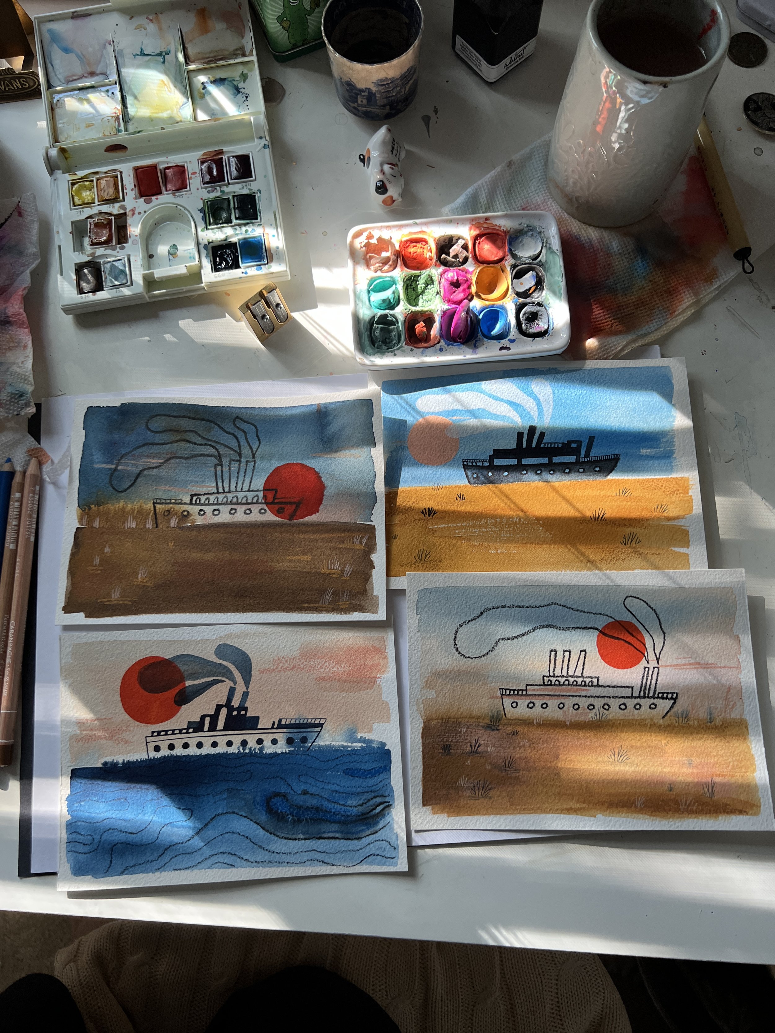
Each illustration for The Vanishing Sea was hand-painted using traditional media that allow the textures and imperfections. I worked with soft pastels and stenciling technique to capture the quiet poetry of water and sand. The palette of ultramarine blue and warm ochre became the visual rhythm of the book, where blue stands for the memory of the sea, and ochre for the desert remains. Every page was created slowly, by hand, as a reflection on loss and transformation.
Color Palette :

It all begins with an idea. Inspired by the nature and colors of the Aral Sea, I built my palette from the landscape itself, where the bright blues of deep lake waters and open skies, and the warm ochres of desert sand and sunlit skin. A touch of red appears midway through the book, echoing a turning point in the history of Central Asia.
I worked with soft pastels, experimenting with tone and texture until the pages felt alive. The biggest challenge was translating the vibrancy of hand-painted art into CMYK printing, where blues and reds often lose their brilliance. I’m grateful to my editors at Chronicle Books, who understood my vision and approved two special Pantone inks to preserve the depth of color.
In print, the red glows vividly, and the blue feels boundless!


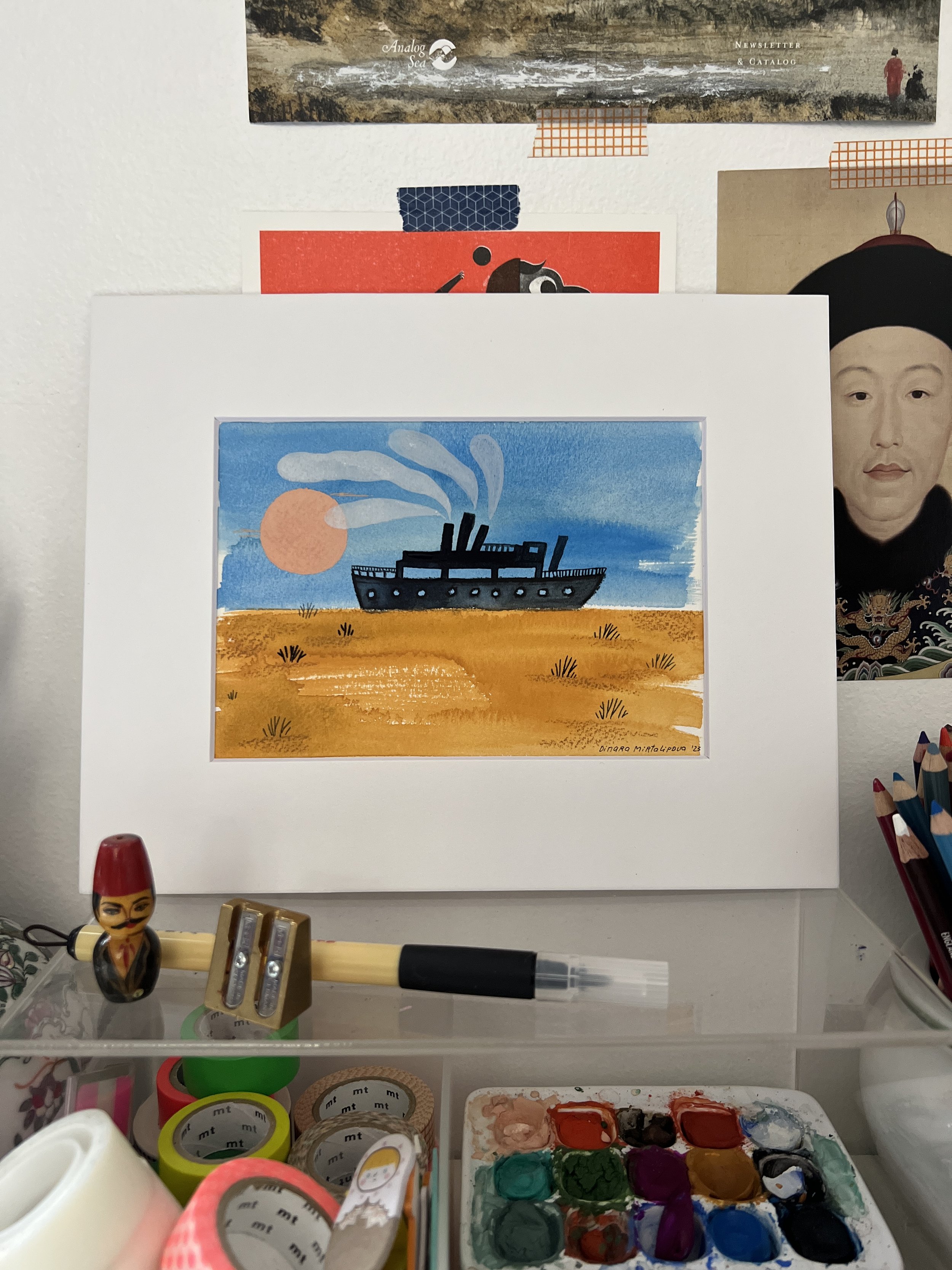
Ultramarine:
Ever since the last Ice Age, when the glaciers of the Tian Shan and Pamir Mountains began to melt and the rivers Amu Darya and Syr Darya poured their rushing waters into the Aral Sea, this region was alive with thriving flora and fauna.
In creating the visuals for The Vanishing Sea, I wanted to capture that majestic abundance and the vastness of the Sea, that was the pulse of life for the villages near and far. I painted in rich shades of ultramarine, letting the blue dominate each page so the reader could feel fully immersed in the Sea’s once boundless expanse.


Red:
The color red appears as a sudden intrusion in the middle of the book just as the era of the Soviet Industrial Revolution burst into the lives of Central Asians and transformed their homeland. In these pages, I wanted the reader to feel that disruption through a shift in palette and style in the the same abrupt change that reshaped the social and environmental fabric of the Aral region.
Ochre:

Ochre shades and textures play a central role in this book. They first appear in the Middle Ages, when villages began to grow along the shore. Later, in modern times, ochre becomes the color of transformation - what was once underwater is now desert. As you flip the pages, the book gradually become more and brown and I wanted the Reader to feel the change through color transformation.


Cover:
When I began working on the cover I was drawn to the idea of illustrating a fishing boat. I started by experimenting with shapes and testing different color combinations. Since collage plays a major role in the interior illustrations, I decided to bring that element to the cover as well, weaving a small piece of it into the composition to connect the outside of the book with the world within.
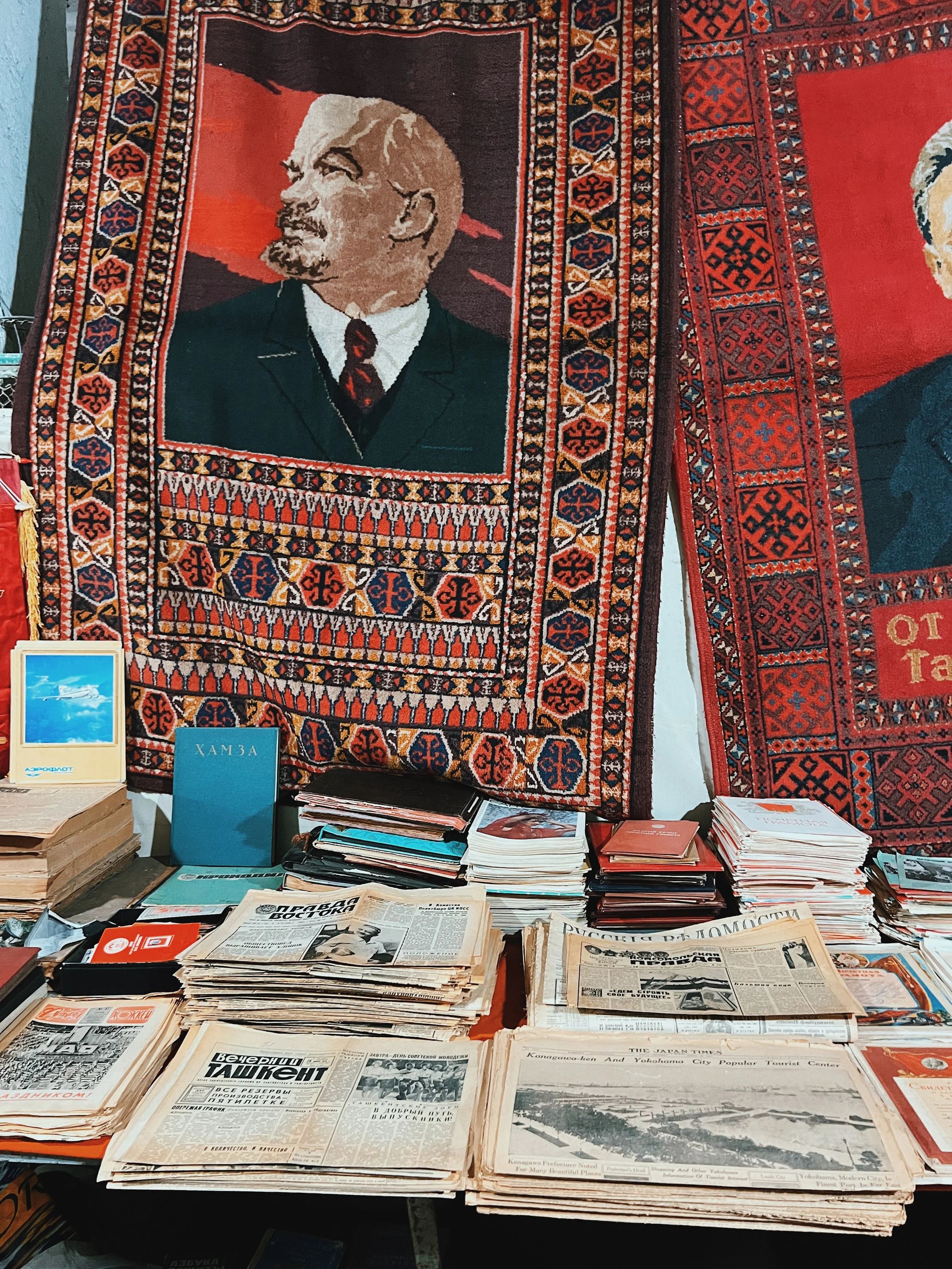
During my research trip to Uzbekistan, I brought back an old newspaper from 1960. I found it both fascinating and deeply ironic that a front page article praising the success of cotton crops that had grown tall and strong despite a difficult harvest season. If only those who wrote it could have foreseen the future and understood the true cost of that “success.”
I decided to include a small piece of this newspaper as a collage element on the book’s cover as a ghostly echo from the past. The cropped words appear mostly abstract, but they carry a hidden story for anyone who looks closely.


Sketchbook and Early explorations:
Just like every project begins with the search for the visuals, this book has started as a combination of sketchbook doodles + little paintings. Please take a scroll!